This guide provides an overview of the changes to the user interface that will occur with the implementation of the PeopleSoft Fluid navigation.
The implementation of PeopleSoft Fluid navigation changes how users interact with the system, making the system more accessible and responsive across different types of devices.
The same elements of pagelets, global actions, Favorites, Recently Used, and Search exist in Fluid navigation.
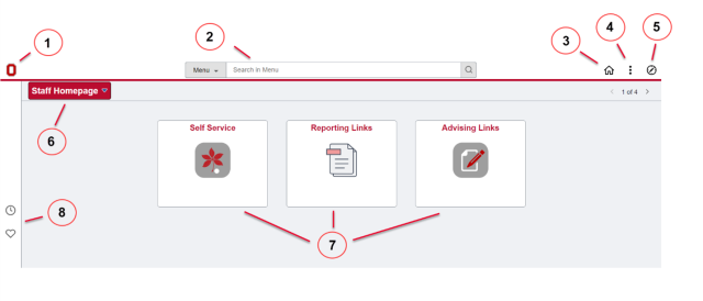
When Fluid navigation is enabled, the PeopleSoft landing page looks like this:
The top banner with its global actions along with the homepage navigator are the most significant changes with Fluid navigation.
Expand each accordion section below to learn about each component in Fluid navigation.
1. University Branding
The university’s Block O icon (or another approved branding image) is configured to display in the upper-left corner of the top banner.
2. Global Search
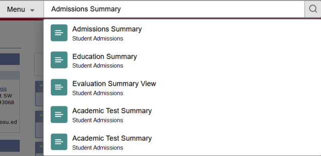
Specific PeopleSoft pages or components can be located using the global search bar. You do not need to know the full name of the page or component; the search uses “contains” logic.

When searching, the first 50 possible results display immediately below the search bar. If you press Enter, you can see those 50 rows along with the full count of possible matches and additional filtering options on the left-hand side of the browser window.

Note: After navigating into a given page or component, the global search bar can be accessed using the magnifying glass icon included in the standardized navigation option icons in the upper-left corner of the top banner.
3. Standardized Navigation Options: Home Icon
The Home icon in the upper-right part of the banner can be used to return to the landing page, displaying the default homepage.
4. Standardized Navigation Options: Actions Button
The Actions Button provides access to session management functions like opening a new browser window within PeopleSoft, or signing out entirely, along with other personalization options, as allowed by security.
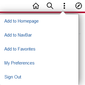
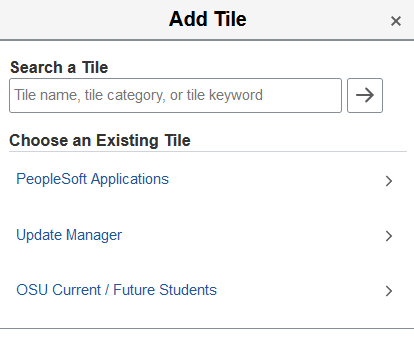
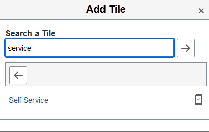
The primary personalization option is "Personalize Homepage". In the Personalize Homepage window, you can enable optional titles using the "Add Tile" button. You can either navigate to the folder where a tile's configuration has been stored or search for a tile using all or some of the tile's name.

Optional tiles can be removed by clicking on the trashcan icon, some tiles can even be reordered by clicking and dragging in the Personalize Homepage display.
Any changes in your homepage personalization take effect once you click the Save button.
Note: After navigating into a given page or component, the Actions menu includes options to save it to your Favorites or to add that specific page or component to a homepage.
5. Standardized Navigation Options: NavBar
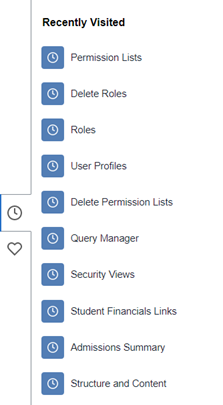
The compass icon in the upper-right corner of the top banner can be used to open the NavBar, which provides access to the pages and components that you’ve recently visited and have marked as favorites.
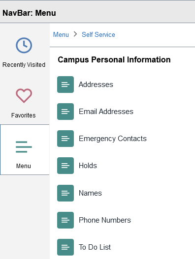
The NavBar also provides access to an alphabetical menu, which is similar to the older “classic” menu navigation structure.
Once you’ve navigated into subfolders using the NavBar’s menu option, the folder structure breadcrumbs display at the top of the NavBar, showing where you are in the overall menu hierarchy.

6. Homepage Selection and Navigator
Below the top banner, the homepage selection button displays at the left side of the page, and a count of available homepages along with navigator icons displays at the right side.
Separate homepages can be configured to group and/or segregate navigation shortcuts according to function or security requirements; users have access to one or more homepages, depending on their individual security settings.
Use either the button or the navigation scroll to move from one homepage to another.
Note: After navigating into a given page or component, the navigator button serves as a “back” button to return to your previous Fluid location. Be aware, however, that this functionality is specific to the browser window’s history -- if you’ve opened a new browser window, this “back” button may not be available.
7. Fluid Tiles
In the main content area of a given homepage, the configured Fluid Tiles display. Each Fluid Tile serves as a shortcut to one or more specific pages, components, queries, etc.; these effectively replace the old navigation collection pagelets used in non-Fluid PeopleSoft navigation.
8. Quick Access Bar
At the left side of the browser, the Quick Access bar provides shortcuts to the pages and components that you’ve visited most recently (up to 10 items), along with the pages and components that you’ve marked as Favorites.
Note: After navigating into a given page or component, this list is available from the NavBar (see above).
Favorites are configured individually by each user. When viewing a given page, use the Actions menu (see above) to Add to Favorites.
Favorites can be deleted, re-labeled, or re-ordered using the Edit Favorites link at the top of the Favorites list.
